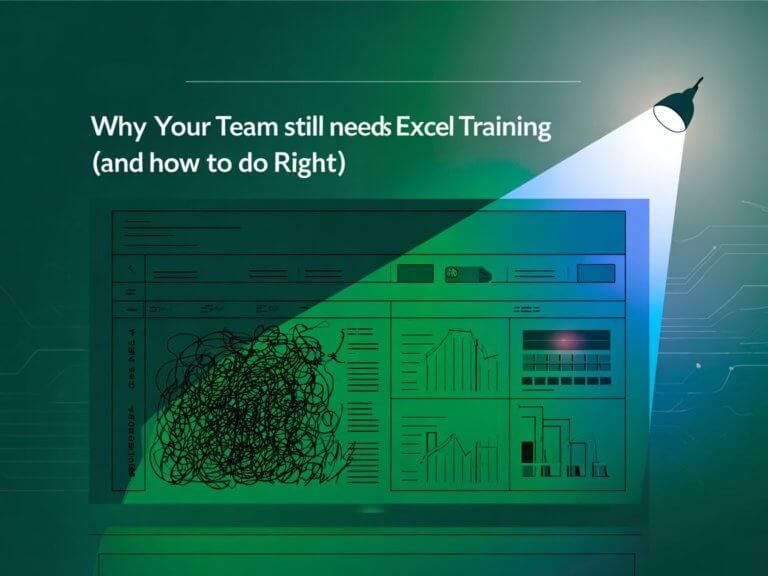
Why Most Excel Training Falls Flat — And What Your Team Actually Needs
“We already know Excel.”
If that’s what your team is saying—but you’re still drowning in clunky reports, time-consuming updates, and fragile formulas—you’re not alone.
Most corporate Excel training teaches people how to use functions but never teaches them how to build smarter systems. The result?
Frustrated users, broken dashboards, endless copy-pasting, and teams that still feel like they’re hacking their way through daily reporting.
Let’s change that.
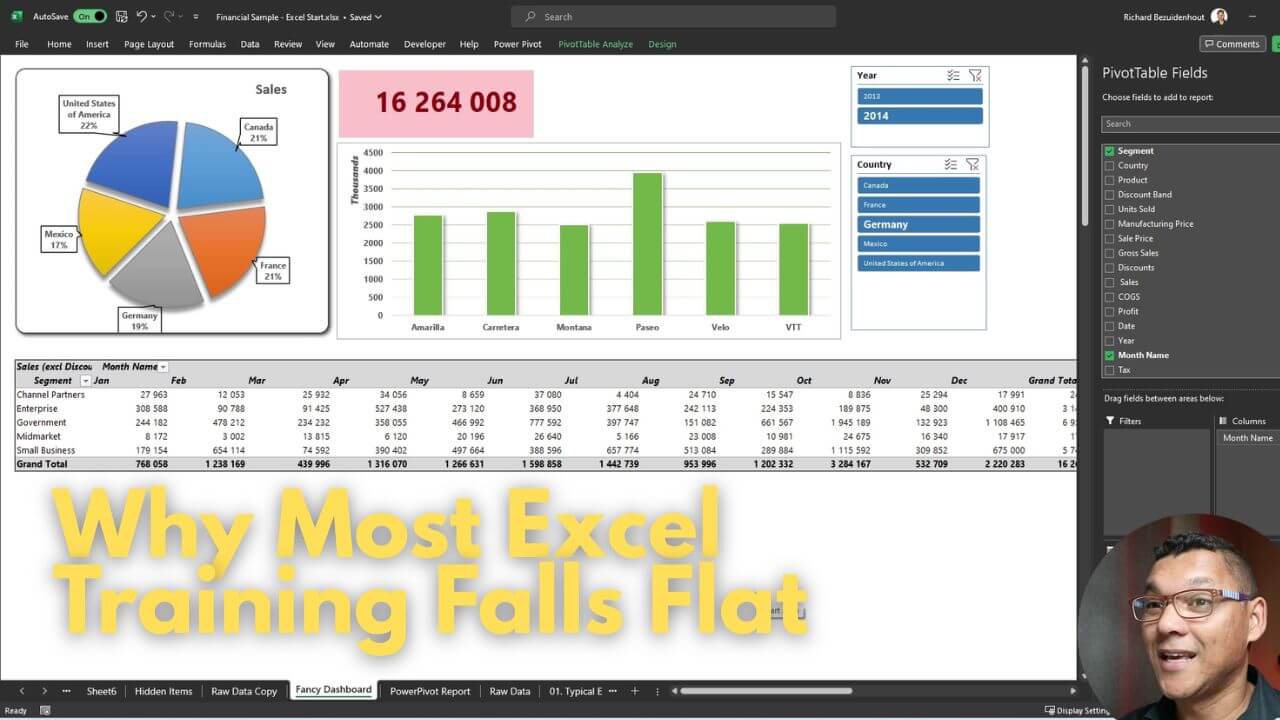
What If Excel Could Feel More Like a Dashboard Tool Than a Spreadsheet?
Here’s the kicker: You don’t need fancy add-ons like Power Query or Power BI to create powerful, professional dashboards in Excel. You just need to master the real magic of the tool—Pivot Tables, custom formatting, slicers, and thoughtful design.
Let’s break it down.
Perfect Tables: Excel’s Best-Kept Secret
We call them “perfect tables” because that’s what they are. When used correctly, pivot tables can become the foundation of every report and KPI your team needs to track.
The difference?
You’re not manually dragging numbers into cells or building fragile formulas that fall apart every month. With a well-structured pivot table:
- You can slice data by region, segment, or product with a click.
- You can swap dimensions in and out without breaking anything.
- You can design custom, branded report layouts in minutes.
No macros. No formulas. No drama.
Slicers: Say Goodbye to 10-Tabs-for-10-Regions
Ever seen a file with a tab for every country or business unit?
Slicers fix that.
With one interactive slicer, your team can filter reports instantly—without duplicate sheets or duplicated effort. This isn’t just about saving time. It’s about making reporting dynamic and scalable.
Metrics That Update Automatically (Even KPIs!)
Need to track sales performance across multiple teams or time periods? Want to show contribution percentages per product or region?
Most people will attempt this with a mix of VLOOKUPs, SUMIFs, and manual math. But that’s not only slow—it’s fragile.
With pivot tables:
- You can calculate % contributions to any parent category instantly.
- You can create dynamic KPIs that change based on slicer selections.
- You can collapse and expand levels of detail without breaking layout.
This isn’t theoretical—it’s a real Excel file, built in under 20 minutes, with clean formatting and zero custom formulas.
Design Matters (And Yes, It Can Look Good)
One of the biggest reasons teams don’t use pivot tables more often? They look… bland.
But a bit of design effort changes everything. With custom styles and templates, you can:
- Brand your dashboards in your team’s color palette
- Add visual hierarchy and readability
- Reuse styles across reports
This isn’t PowerPoint pasted over Excel—it’s beautiful, fully dynamic reporting, made entirely within Excel.
Training That’s Built for Today’s Teams
Your team doesn’t need more theory.
They need to know how to build reports that actually work—under pressure, with real data, and with confidence that nothing will break.
That’s the kind of Excel training we offer.
✔️ Focused on real-world reporting
✔️ Designed for business users, not just finance pros
✔️ No fluff—just smart systems your team will actually use
Ready to Level Up Your Team’s Reporting Game?
Let’s stop settling for boring, rigid training that leaves your team frustrated.
Let’s build something better—together.
👉 Get in touch to explore hands-on Excel training that works